7 Design Tips to Help Your Business Signs Grab More Attention
Business signage represents one of the most cost-effective marketing investments, working continuously to attract customers, communicate brand identity, and differentiate companies from competitors through visual communication that potential customers see repeatedly. Many businesses invest in signs without fully understanding design principles that maximize visibility, readability, and the psychological impact that effective signage creates through strategic design choices affecting how viewers perceive and respond to messaging. Understanding what makes signage effective helps you create or evaluate designs that capture attention, communicate clearly, and motivate desired customer actions rather than producing expensive signs that fail to perform due to poor design decisions. The difference between signage that drives business growth and that which blends into visual clutter often comes down to whether designs follow proven principles about contrast, simplicity, positioning, and the visual psychology that influences how people process information in environments filled with competing stimuli. Learning essential design strategies empowers you to maximize return on signage investment by creating displays that stand out, communicate effectively, and create the positive brand impressions that quality signage delivers when design excellence combines with strategic messaging and proper installation, creating the visibility that successful business signs require for attracting and converting potential customers.
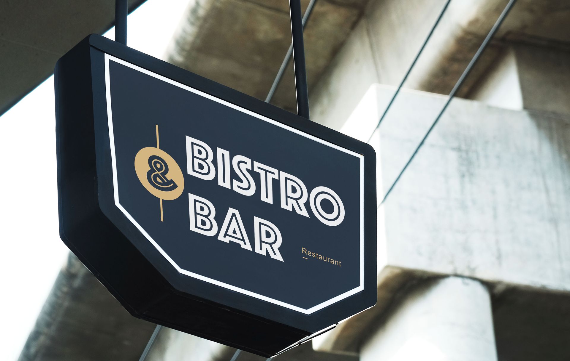
1. Maximizing Contrast for Visibility
According to Forbes, about two-thirds of consumers say outdoor ads shape their perception of brands, and 46% associate those ads with premium or high-quality brands. High contrast between text and background ensures readability from distances where potential customers first encounter signage, making color selection critical for visibility that poor contrast undermines, despite otherwise quality design. Dark text on light backgrounds or light text on dark backgrounds creates the distinction that enables quick reading without eye strain or confusion. The contrast that effective business signs provide should remain strong across varying lighting conditions, including bright sunlight, overcast skies, and nighttime illumination, if signs remain visible after dark. Professional sign designers understand that aesthetic preferences must yield to readability requirements, ensuring color combinations create sufficient contrast for visibility rather than prioritizing brand color use when those colors lack the contrast that distance viewing demands for immediate recognition and message comprehension.
2. Choosing Appropriate Font Sizes and Styles
Letter height should allow comfortable reading from maximum anticipated viewing distances, with general rules suggesting one inch of letter height for every ten feet of viewing distance as minimum sizing. This size calculation ensures legibility rather than forcing viewers to strain or move closer for message comprehension that inadequate sizing prevents. The font style selection should prioritize clarity over decorative appeal, avoiding script or ornate fonts that prove difficult to read quickly from moving vehicles or at distances. Strategic business signs use simple, bold typefaces that ensure instant readability rather than elaborate fonts that might seem attractive in close-up design reviews but fail when viewed at intended distances under real-world conditions, where split-second visibility determines whether passing motorists can read and process messages before moving beyond viewing range.
3. Limiting Word Count for Quick Comprehension
Effective signage communicates essential information quickly, typically limiting messages to seven words or fewer that viewers can process in the brief moments they have for sign reading. This brevity forces focus on core messaging rather than attempting to communicate everything about businesses through single signs that cannot accommodate extensive information without becoming unreadable. The editing discipline that effective signs require ensures only critical information appears, making every word count toward communication goals. Concise business signs respect viewer attention limitations while also improving aesthetics through the clean, uncluttered appearance that minimal text creates compared to crowded designs attempting to communicate too much information through insufficient space, resulting in small text that distance viewing renders illegible despite design intentions to provide comprehensive messaging that ambitious word counts make impossible to execute legibly.
4. Incorporating Strategic Color Psychology
Colors evoke emotional responses and associations that influence brand perception, with red creating urgency and excitement, blue conveying trust and professionalism, and green suggesting growth or environmental consciousness. This psychological impact makes color selection a strategic branding decision beyond just aesthetic preference or corporate color coordination. The cultural associations that colors carry vary between demographics, making audience understanding essential for color choices that resonate with target customers. Psychologically informed signs leverage color meaning strategically, selecting palettes that reinforce intended brand messages while maintaining the visibility and contrast that readability requires, creating the emotional connections and brand associations that color choices communicate subconsciously to viewers whose perceptions and responses colors influence more powerfully than many business owners recognize when making what seem like purely aesthetic decisions about signage appearance.
5. Ensuring Proper Placement and Visibility
Sign location affects visibility dramatically, with positioning relative to traffic flow, sight lines, obstructions, and viewing angles determining whether signs reach intended audiences effectively. This placement strategy requires understanding how customers approach businesses, what captures attention during those approaches, and what might obstruct views from critical angles. The height, setback, and orientation all affect whether signs can be seen and read by passing motorists or pedestrians within the brief windows available for message processing. Optimally positioned business signs account for approach directions, typical viewing speeds, and potential obstructions, including landscaping, other signs, or architectural elements that block sight lines, ensuring placement maximizes visibility rather than accepting convenient mounting locations that seem adequate during installation but prove ineffective when actual customer approach patterns reveal visibility problems that proper placement analysis would have prevented.
6. Creating Visual Hierarchy Through Design
Information arrangement should guide viewers to the most important content first through size, color, and positioning that create reading sequences matching communication priorities. This hierarchy ensures company names, key offerings, or calls to action receive primary attention before secondary information that supports but doesn't lead the messaging. The visual flow that an effective hierarchy creates allows quick information processing as eyes naturally move from dominant elements to supporting details. Well-designed business signs organize information logically through a visual hierarchy that typography, spacing, and contrast establish, preventing the confusion that results when all elements receive equal visual weight without a clear indication of what matters most, leaving viewers uncertain about what information to process first or what actions signs intend to motivate through messaging that lacks the organizational clarity visual hierarchy provides.
7. Incorporating Lighting for 24-Hour Visibility
Illuminated signage extends visibility beyond daylight hours, ensuring businesses remain noticeable during evening hours when many customers shop, dine, or seek services. This extended visibility proves particularly valuable for restaurants, entertainment venues, and service businesses operating evening hours when unlit signs disappear into darkness. The illumination options, including internal lighting, external spotlights, or LED displays, each offer different aesthetics, costs, and maintenance requirements, affecting selection decisions. Effectively illuminated business signs ensure consistent visibility regardless of time or ambient lighting conditions, maintaining the attention-grabbing impact that daylight viewing provides while extending that visibility throughout evening hours when quality lighting transforms signs from invisible to prominent features that guide customers to businesses that unlit signs leave hidden in darkness, which eliminates the marketing value that daytime visibility provides.
Understanding these design principles helps business owners create signage that effectively attracts customers, communicates brand identity, and drives business growth through the visual impact that quality signs deliver. The investment in well-designed, professionally produced signage pays dividends through increased visibility, enhanced brand perception, and customer attraction that poor signage cannot achieve, regardless of business quality or service excellence. Making informed decisions about sign design ensures marketing budgets deliver maximum return through the effective visual communication that strategic design creates when excellence in planning, fabrication, and installation combine to produce signage that truly works. Whether you need permits and design, sign fabrication and installation, or sign repair and maintenance, Vancouver Sign Co. has been in business since 1923, offers competitive pricing, and provides quality craftsmanship. For more information, contact us today!


Share On: